Highlighting ‘Free’ attracts budget-conscious users, while focusing on ‘Template’ supports searches for ready-made solutions.
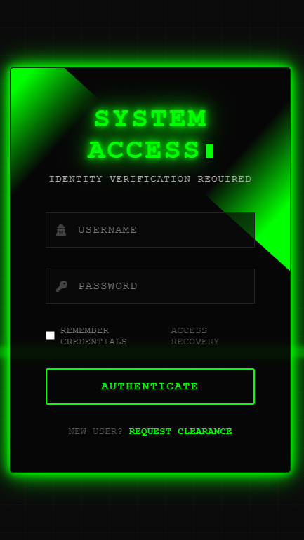
We will see how to create a login form through this blog. The programs we used to create this form are HTML, CSS, and JavaScript. With the help of these programs, we will create a login page, and it will be totally free. There is no back-end or functional content in the frontend.
I may not be able to explain the entire program to you, but I have highlighted the main points and told you below.
If you want to download the codes for this login form, then you have to go below and download and copy them.
Code
<!DOCTYPE html>
<html lang="en">
<head>
    <meta charset="UTF-8">
    <meta name="viewport" content="width=device-width, initial-scale=1.0">
    <title>Cyberpunk Login</title>
    <link rel="stylesheet" href="https://cdnjs.cloudflare.com/ajax/libs/font-awesome/6.4.0/css/all.min.css">
    <style>
        :root {
            --neon-green: #0f0;
            --neon-pink: #f0f;
            --dark-bg: #0a0a0a;
            --darker-bg: #050505;
            --light-text: #e0e0e0;
            --glow: 0 0 10px var(--neon-green),
                    0 0 20px var(--neon-green),
                    0 0 40px var(--neon-green);
        }

        * {
            margin: 0;
            padding: 0;
            box-sizing: border-box;
            font-family: 'Rajdhani', 'Courier New', monospace;
        }

        body {
            display: flex;
            justify-content: center;
            align-items: center;
            min-height: 100vh;
            background-color: var(--dark-bg);
            overflow: hidden;
            position: relative;
        }

        /* Cyber grid background */
        .cyber-grid {
            position: absolute;
            top: 0;
            left: 0;
            width: 100%;
            height: 100%;
            background:
                linear-gradient(rgba(0, 255, 0, 0.1) 1px, transparent 1px),
                linear-gradient(90deg, rgba(0, 255, 0, 0.1) 1px, transparent 1px);
            background-size: 40px 40px;
            z-index: -3;
            opacity: 0.3;
        }

        /* Animated scanline effect */
        .scanline {
            position: absolute;
            top: 0;
            left: 0;
            width: 100%;
            height: 10px;
            background: rgba(0, 255, 0, 0.5);
            box-shadow: 0 0 10px var(--neon-green);
            z-index: -2;
            animation: scan 8s linear infinite;
            opacity: 0.7;
        }

        @keyframes scan {
            0% { top: -10px; }
            100% { top: 100%; }
        }

        .login-container {
            position: relative;
            width: 400px;
            background: rgba(5, 5, 5, 0.8);
            border-radius: 5px;
            padding: 50px;
            box-shadow: var(--glow);
            overflow: hidden;
            animation: fadeIn 1s ease-out forwards;
            z-index: 1;
            backdrop-filter: blur(5px);
            border: 1px solid rgba(0, 255, 0, 0.2);
        }

        .login-container::before {
            content: '';
            position: absolute;
            top: -50%;
            left: -50%;
            width: 400px;
            height: 400px;
            background: linear-gradient(0deg, transparent,
                                     transparent, var(--neon-green),
                                     var(--neon-green), var(--neon-green));
            transform-origin: bottom right;
            animation: animateBorder 6s linear infinite;
            z-index: -1;
        }

        .login-container::after {
            content: '';
            position: absolute;
            top: -50%;
            left: -50%;
            width: 400px;
            height: 400px;
            background: linear-gradient(0deg, transparent,
                                     transparent, var(--neon-green),
                                     var(--neon-green), var(--neon-green));
            transform-origin: bottom right;
            animation: animateBorder 6s linear infinite;
            animation-delay: -3s;
            z-index: -1;
        }

        @keyframes animateBorder {
            0% { transform: rotate(0deg); }
            100% { transform: rotate(360deg); }
        }

        @keyframes fadeIn {
            from { opacity: 0; transform: translateY(20px); }
            to { opacity: 1; transform: translateY(0); }
        }

        .header {
            text-align: center;
            margin-bottom: 40px;
        }

        .header h2 {
            color: var(--neon-green);
            font-size: 2.5rem;
            font-weight: 700;
            margin-bottom: 10px;
            text-shadow: var(--glow);
            letter-spacing: 3px;
            text-transform: uppercase;
        }

        .header p {
            color: #aaa;
            font-size: 0.9rem;
            letter-spacing: 1px;
        }

        .input-group {
            position: relative;
            margin-bottom: 30px;
        }

        .input-group input {
            width: 100%;
            padding: 15px 20px 15px 45px;
            background: rgba(10, 10, 10, 0.7);
            border: 1px solid #222;
            outline: none;
            font-size: 1rem;
            color: var(--light-text);
            transition: all 0.3s ease;
            letter-spacing: 1px;
        }

        .input-group input:focus {
            border-color: var(--neon-green);
            box-shadow: 0 0 10px rgba(0, 255, 0, 0.3);
        }

        .input-group i {
            position: absolute;
            left: 15px;
            top: 50%;
            transform: translateY(-50%);
            color: #444;
            transition: all 0.3s ease;
        }

        .input-group input:focus ~ i {
            color: var(--neon-green);
            text-shadow: 0 0 5px var(--neon-green);
        }

        .options {
            display: flex;
            justify-content: space-between;
            align-items: center;
            margin-bottom: 30px;
            font-size: 0.9rem;
        }

        .remember-me {
            display: flex;
            align-items: center;
        }

        .remember-me input {
            margin-right: 8px;
            accent-color: var(--neon-green);
        }

        .remember-me label {
            color: #777;
            transition: all 0.3s ease;
        }

        .remember-me:hover label {
            color: var(--neon-green);
            text-shadow: 0 0 5px var(--neon-green);
        }

        .forgot-pass a {
            color: #555;
            text-decoration: none;
            transition: all 0.3s ease;
        }

        .forgot-pass a:hover {
            color: var(--neon-green);
            text-shadow: 0 0 5px var(--neon-green);
        }

        .login-btn {
            width: 100%;
            padding: 15px;
            background: transparent;
            color: var(--neon-green);
            border: 2px solid var(--neon-green);
            border-radius: 3px;
            font-size: 1rem;
            font-weight: 600;
            cursor: pointer;
            transition: all 0.3s ease;
            position: relative;
            overflow: hidden;
            text-transform: uppercase;
            letter-spacing: 2px;
        }

        .login-btn:hover {
            background: var(--neon-green);
            color: var(--dark-bg);
            box-shadow: var(--glow);
            text-shadow: 0 0 5px #000;
        }

        .login-btn::before {
            content: '';
            position: absolute;
            top: 0;
            left: -100%;
            width: 100%;
            height: 100%;
            background: linear-gradient(90deg, transparent,
                                     rgba(0, 255, 0, 0.2), transparent);
            transition: 0.5s;
        }

        .login-btn:hover::before {
            left: 100%;
        }

        .signup-link {
            text-align: center;
            margin-top: 30px;
            color: #555;
            font-size: 0.9rem;
        }

        .signup-link a {
            color: var(--neon-green);
            text-decoration: none;
            transition: all 0.3s ease;
            font-weight: 600;
        }

        .signup-link a:hover {
            text-shadow: 0 0 5px var(--neon-green);
        }

        /* Terminal-style cursor effect */
        @keyframes blink {
            0%, 100% { opacity: 1; }
            50% { opacity: 0; }
        }

        .cursor {
            display: inline-block;
            width: 10px;
            height: 20px;
            background: var(--neon-green);
            vertical-align: middle;
            margin-left: 5px;
            animation: blink 1s step-end infinite;
        }
    </style>
</head>
<body>
    <div class="cyber-grid"></div>
    <div class="scanline"></div>

    <div class="login-container">
        <div class="header">
            <h2>SYSTEM ACCESS<div class="cursor"></div></h2>
            <p>IDENTITY VERIFICATION REQUIRED</p>
        </div>

        <form>
            <div class="input-group">
                <i class="fas fa-user-secret"></i>
                <input type="text" placeholder="USERNAME" required>
            </div>

            <div class="input-group">
                <i class="fas fa-key"></i>
                <input type="password" placeholder="PASSWORD" required>
            </div>

            <div class="options">
                <div class="remember-me">
                    <input type="checkbox" id="remember">
                    <label for="remember">REMEMBER CREDENTIALS</label>
                </div>
                <div class="forgot-pass">
                    <a href="#">ACCESS RECOVERY</a>
                </div>
            </div>

            <button type="submit" class="login-btn">LOGIN</button>

            <div class="signup-link">
                NEW USER? <a href="#">REQUEST CLEARANCE</a>
            </div>
        </form>
    </div>
</body>
</html>
1. Visual Design Elements
- Cyberpunk Aesthetic:
- Dark background with neon green accents
- Glowing text and UI elements (
text-shadowandbox-shadow) - Digital grid pattern background (
.cyber-grid) - Animated scanline effect (
.scanline)
- Terminal-Style UI:
- Monospace font
- Blinking cursor animation (
.cursor) - Uppercase labels for “hacker terminal” feel
2. Animations & Effects
- Border Animation:
- Rotating neon green border (using
::beforeand::afterpseudo-elements withanimateBorderkeyframes)
- Rotating neon green border (using
- Interactive Elements:
- Input fields glow on focus (green border + icon color change)
- Button hover effect (fills with neon green + light sweep animation via
::before) - “Remember me” and “Forgot password” links glow on hover
- Page Load Animation:
- Fade-in effect (
fadeInkeyframes)
- Fade-in effect (
3. Technical Features
- Responsive Layout:
- Works on mobile and desktop (fixed-width container at 400px)
- Uses
backdrop-filter: blur()for modern glass effect
- Form Functionality:
- Username/password fields with Font Awesome icons
- “Remember me” checkbox with custom styling (
accent-color) - Placeholder submit action (would connect to backend in real implementation)
- CSS Variables:
- Color scheme defined in
:rootfor easy theming (e.g.,--neon-green,--dark-bg)
- Color scheme defined in
4. Cyberpunk-Specific Touches
- Terminology:
- “SYSTEM ACCESS” header
- “AUTHENTICATE” instead of “Login”
- “REQUEST CLEARANCE” for signup link
- Visual Details:
- Hacker-style icons (
fa-user-secret,fa-key) - Animated grid background simulating a digital matrix
- Pulsing scanline like old CRT monitors
- Hacker-style icons (
5. Code Structure
- Single HTML File:
- Embedded CSS (no external stylesheet)
- No JavaScript required (pure CSS animations)
- Semantic HTML5 tags (
<section>,<form>)
- Performance Optimized:
- Hardware-accelerated animations (
transformproperties) - Efficient use of pseudo-elements for complex effects
- Hardware-accelerated animations (
Conclusion:
Very simple and very easy method we have shown you to do this yourself easily, Very simple and very easy method we have shown you and you can do this thing yourself and we have presented this blog to you for better improvement and experience and from the information provided in my blog, you can customize any picture, any picture in this way, you can easily change it.
NOTE: When you follow my steps it is very important to keep your computer.
If you have benefited from the information given to me, then you can follow my website. If you want to see such type of things first, then follow my website.
Also, I publish these types of things to you through YouTube. If you have difficulty in reading and understanding, you can subscribe to my YouTube channel. You can also watch the same video on YouTube.