Highlighting ‘Free’ attracts budget-conscious users, while focusing on ‘Template’ supports searches for ready-made solutions.
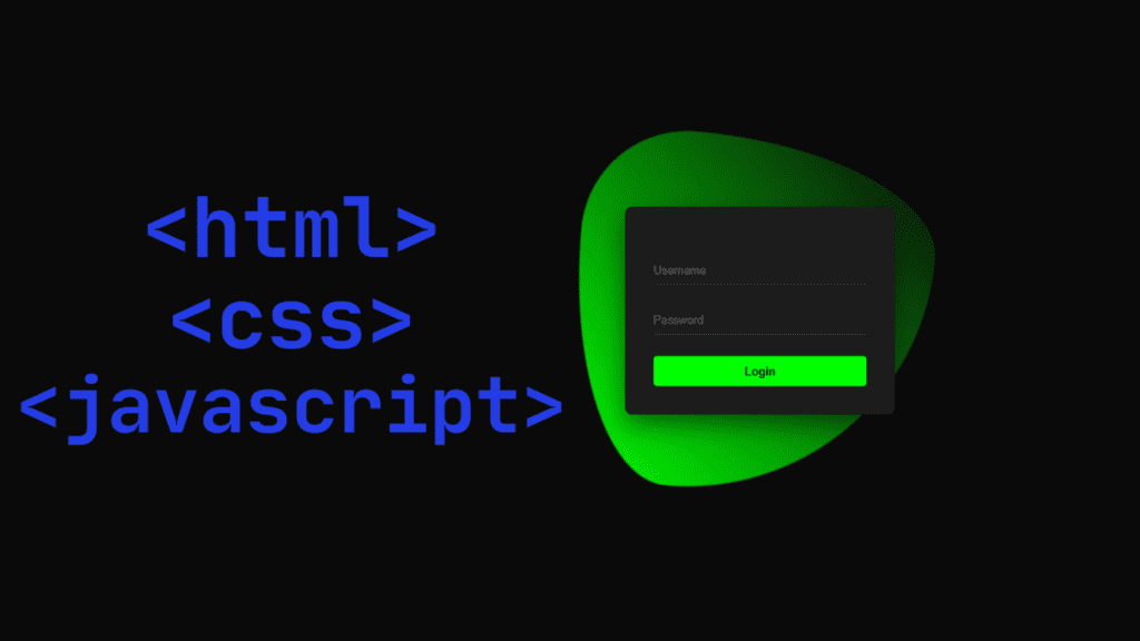
The login page I created has a black background and an animation of a green triangle moving around. There is a dash that is a little high, like a provocation. You can put something else in place of username and password. This is just a front end, and there is no back-end or functional thing to do here.
If you want to save any data that you want to use after submitting it or logging in, then you need to create a back end where your database will be and all the data will be saved.
Through this blog, we will see how to create a login form. The programs we used to create this form are HTML, CSS, and JavaScript. With the help of these programs, we will create a totally free login page. There is no back-end or functional content in the front end.
I may not be able to explain the entire program to you, but I have highlighted the main points and told you below.
If you want to download the codes for this login form, then you have to go below and download and copy them.

CODE
<!DOCTYPE html>
<html lang="en">
<head>
    <meta charset="UTF-8">
    <meta name="viewport" content="width=device-width, initial-scale=1.0">
    <title>Animated Login Form</title>
    <style>
        * {
            margin: 0;
            padding: 0;
            box-sizing: border-box;
            font-family: 'Poppins', sans-serif;
        }

        body {
            display: flex;
            justify-content: center;
            align-items: center;
            min-height: 100vh;
            background: #0a0a0a;
            overflow: hidden;
        }

        .container {
            position: relative;
            width: 380px;
            padding: 40px;
            background: #1c1c1c;
            border-radius: 10px;
            box-shadow: 0 15px 35px rgba(0,0,0,0.5);
            transform: translateY(50px);
            opacity: 0;
            animation: fadeIn 1s forwards;
        }

        @keyframes fadeIn {
            to {
                opacity: 1;
                transform: translateY(0);
            }
        }

        .form-group {
            position: relative;
            margin: 30px 0;
        }

        .form-group input {
            width: 100%;
            padding: 10px;
            background: transparent;
            border: none;
            border-bottom: 2px solid #333;
            color: #fff;
            font-size: 1em;
            transition: 0.5s;
        }

        .form-group label {
            position: absolute;
            left: 0;
            padding: 10px 0;
            pointer-events: none;
            color: #666;
            transition: 0.5s;
        }

        .form-group input:focus,
        .form-group input:valid {
            border-bottom: 2px solid #0f0;
            outline: none;
        }

        .form-group input:focus ~ label,
        .form-group input:valid ~ label {
            color: #0f0;
            transform: translateY(-20px);
            font-size: 0.8em;
        }

        button {
            width: 100%;
            padding: 12px;
            background: #0f0;
            border: none;
            border-radius: 5px;
            cursor: pointer;
            font-size: 1em;
            font-weight: 600;
            transition: 0.5s;
        }

        button:hover {
            background: #0c0;
            transform: translateY(-2px);
        }

        .floating-bg {
            position: absolute;
            width: 500px;
            height: 500px;
            background: linear-gradient(45deg, #0f0, transparent);
            animation: float 10s infinite;
            border-radius: 30% 70% 70% 30% / 30% 30% 70% 70%;
        }

        @keyframes float {
            0%, 100% {
                transform: translate(0, 0) rotate(0deg);
            }
            25% {
                transform: translate(100px, 100px) rotate(45deg);
            }
            50% {
                transform: translate(-50px, 150px) rotate(-45deg);
            }
            75% {
                transform: translate(-100px, 50px) rotate(45deg);
            }
        }

        .loading {
            display: none;
            position: absolute;
            width: 100%;
            height: 100%;
            background: rgba(0,0,0,0.5);
            justify-content: center;
            align-items: center;
            top: 0;
            left: 0;
            border-radius: 10px;
        }

        .spinner {
            width: 40px;
            height: 40px;
            border: 4px solid #f3f3f3;
            border-top: 4px solid #0f0;
            border-radius: 50%;
            animation: spin 1s linear infinite;
        }

        @keyframes spin {
            0% { transform: rotate(0deg); }
            100% { transform: rotate(360deg); }
        }
    </style>
</head>
<body>
    <div class="floating-bg"></div>
    <div class="container">
        <form id="loginForm">
            <div class="form-group">
                <input type="text" required>
                <label>Username</label>
            </div>
            <div class="form-group">
                <input type="password" required>
                <label>Password</label>
            </div>
            <button type="submit">Login</button>
        </form>
        <div class="loading">
            <div class="spinner"></div>
        </div>
    </div>

    <script>
        document.getElementById('loginForm').addEventListener('submit', function(e) {
            e.preventDefault();

            const loading = document.querySelector('.loading');
            loading.style.display = 'flex';

            // Simulate API call
            setTimeout(() => {
                loading.style.display = 'none';
                alert('Login successful!');
            }, 2000);
        });
    </script>
</body>
</html>
Here are the main highlights and key programming concepts demonstrated in this animated login form code:
We have highlighted and shown you the main points of this programming.You can study the points I have highlighted above and then if you want to customize it as per your own, you can do so. I have provided 4 open source ones for you, you can customize them as per your own preference.
1. Modern CSS Techniques
- Flexbox Layout: Uses
display: flexfor perfect vertical and horizontal center - CSS Animations: Includes multiple animations (
fadeIn,float,spin) with@keyframes - Smooth Transitions: All interactive elements have smooth 0.5s transitions
- Complex Gradients: Uses
linear-gradientfor the floating background effect - Custom Shape Design: Creates organic shapes with
border-radius: 30% 70% 70% 30% / 30% 30% 70% 70%
2. Interaction Design
- Floating Label Pattern: Labels animate upward when inputs are focused/filled
- Input Validation Styling: Changes border color to green when valid (
:validpseudo-class) - Focus States: Clear visual feedback on focused inputs (
:focuspseudo-class) - Loading State: Shows spinner during simulated authentication
3. Visual Effects
- Animated Background: Floating gradient blob with continuous transformation
- Form Entrance Animation: Smooth fade-in with upward movement
- Button Hover Effects: Color darkening and slight upward movement
- Loading Spinner: Pure CSS spinning animation
4. JavaScript (JS) Functionality
- Form Submission Handling: Prevents default form submission with
e.preventDefault() - Simulated API Call: Uses
setTimeoutto mimic server response delay - DOM Manipulation: Shows/hides loading spinner dynamically
5. Responsive Design
- Viewport Meta Tag: Ensures proper mobile rendering
- Relative Sizing: Uses
vh,%, andemunits for scalability - Centered Layout: Works on all screen sizes
6. Aesthetic Choices
- Dark Mode Design: Black/dark gray color scheme with green accents
- Neon Green Accents: Creates high contrast for interactive elements
- Subtle Shadows: Adds depth with
box-shadow
7. Best Practices
- Semantic HTML: Proper form structure
- CSS Organization: Logical grouping of related styles
- Performance: Hardware-accelerated animations using
transform - Accessibility: Includes form labels (though could be enhanced with proper
forattributes)
This code serves as an excellent example of modern frontend development techniques combining aesthetic design with functional interaction patterns, all achieved with just HTML, CSS, and minimal JavaScript.
Conclusion:
Very simple and very easy method we have shown you to do this yourself easily, Very simple and very easy method we have shown you and you can do this thing yourself and we have presented this blog to you for better improvement and experience and from the information provided in my blog, you can customize any picture, any picture in this way, you can easily change it.
NOTE: When you follow my steps it is very important to keep your computer.
If you have benefited from the information given to me, then you can follow my website. If you want to see such type of things first, then follow my website.
Also, I publish these types of things to you through YouTube. If you have difficulty in reading and understanding, you can subscribe to my YouTube channel. You can also watch the same video on YouTube.
If you want to see the output like this, you can see the receipt by clicking on the video I have given below.
Discover more from Tech Ultimates - Latest Tech News & Tricks
Subscribe to get the latest posts sent to your email.